The key factors in getting the most out of your website and upgrading it to unstoppable.
Because your website is generally the first impression you give potential clients, it has to be attractive. Your website will be their initial point of contact if they found you through a search or a link shared by a friend. They will visit your website before visiting your business or speaking with your employees. You want to make a good first impression to get the rose.
Here are 8 things to focus on when building a website:
1- Purpose/Goal of the Website
Having a website for the sake of having a website is rather pointless. Harsh? No, not at all!
You need to have a purpose or goal for your website and if done correctly, it should deliver specific results. Maybe you want to create a website to showcase your products and services or maybe you want to create a hub to inform and educate people. The reason has to be the driving force and will be the guide for your layout, design, call to action, and any other features you may implement.
Your goal and purpose will also directly guide your audience to achieve these results. This is usually done through a call to action; it will make users feel they should engage. This means that your website needs to contain a clear and concise call-to-action that will make users want to take the action that you are asking them to take.
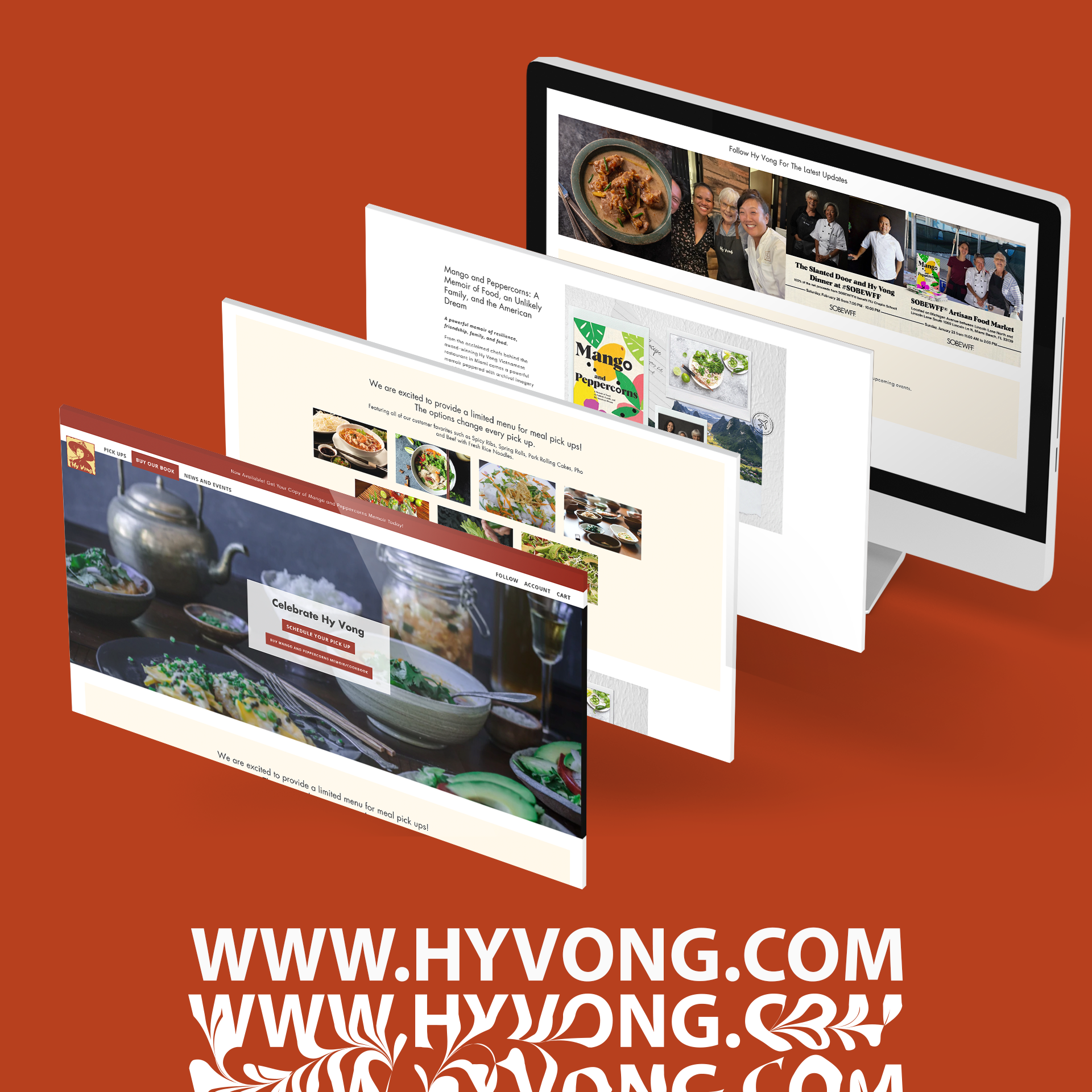
In the example below, we have Hyvong, we wanted to uplift their website and create a space for brand awareness and sales of their new cookbook. The entire flow of the website was designed to work with this goal in mind, especially the precise call to actions that ask clients to read more, make a reservation or purchase their cookbook.
2- Web Design & Layout
The look and feel of your website can be just as important as its content. If you intend to sell products or services, a beautifully designed website will be the first point of contact for potential customers. The way people perceive your brand is based on their first impression of your website. Consider your website a window in a store, you have to make sure it looks good enough to invite them in.
Your window design will be your layout. This is extremely important when it comes to web design. You want to make sure that the pages are easy to navigate and that the user can find what they are looking for quickly. You also want to use colours that are pleasing to the eye and that match your branding.
From an aesthetic point of view, the user’s experience is key to success. When designing the actual look of your website, you need to take into account the latest trends and techniques, as most search engines use these as a way of classifying your content.
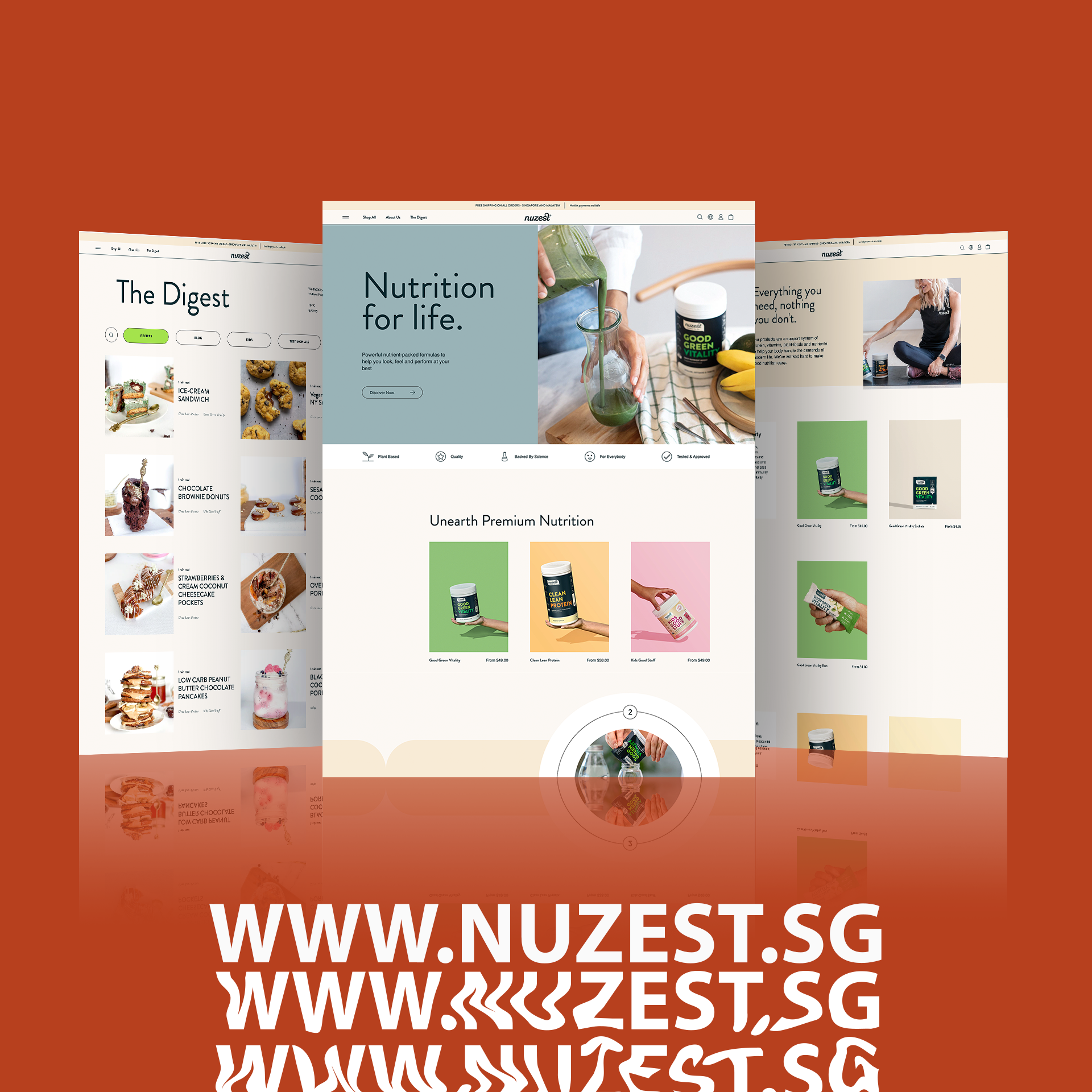
It doesn’t matter whether you are in the entertainment industry or a product-based industry, have a look at the websites we did for Eurovision Australia and Nuzest SG. Both followed a well-structured theme with a layout that made sense for the goal, whether it was to shop for supplements or to get the latest information and access to an event.

3- Typography
Typography refers to the types of fonts you will use on your website, how big they are, and how they relate to each other. It is important to choose fonts that fit the theme of your website and make it easy for users to read. Make sure that you use high-quality fonts on your website and that they are used correctly. Not only does it make the text look professional, but it also gives your site a more professional feel.
An extra bit of advice, do not use serif fonts unless you are going for a classic, traditional look. Sans-serif fonts are a better choice for websites in terms of readability.
Have a look at the fonts we used for Hyvong, they are clean, consistent and only alternate in-text hierarchy to guide the reader’s eyes.
4- Security
Many people overlook this step because we don’t realize that our websites need the right security. You need to be able to protect any sensitive information that might be recorded on your website. For example, if you’re building a site for a lawyer, then there will probably be some client information on it. Here, you will need to encrypt the site using SSL.
5- Site Performance, Speed and Cross browser compatibility
Your site should always be responsive. Not only do you need to take into account the fact that your visitors will most likely be on multiple devices, but also in different locations, with variable bandwidth connections. You want your site to work quickly, across all devices (especially mobile) and across all bandwidths and locations.
We all know that mobile websites are going to be the norm in the near future. They’re fast, you can apply innovative design and they can load easily, so make sure that your device is responsive to make sure that it looks good on any screen. (It’s important because most people will access your website with their mobile device.)
Regarding the overall speed of your website, it’s worth noting that the framework and images can severely affect the website, especially if you select a platform that doesn’t support the latest features and has a slow loading time. This will make your site less appealing to users.
If this wasn’t motivating enough, we can tell you that Google’s algorithm prioritizes mobile-friendliness and modern design. Google’s search intent is to provide users with the most useful answers to their questions. Since we’ve seen that responsive design is the best way to meet users’ expectations, your site should include it.
6- Target Market
Your website’s design will depend highly on the clientele and the kind of business you’re seeking to target. The same way you developed your brand to speak to your consumers and give them something to relate to, you need to create a hub (your website) that makes your audience want to stick around.
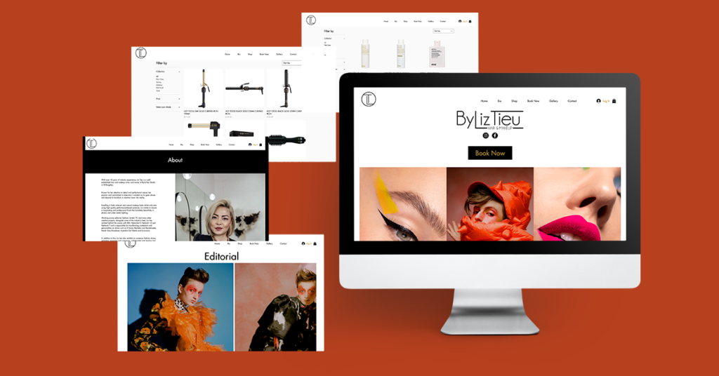
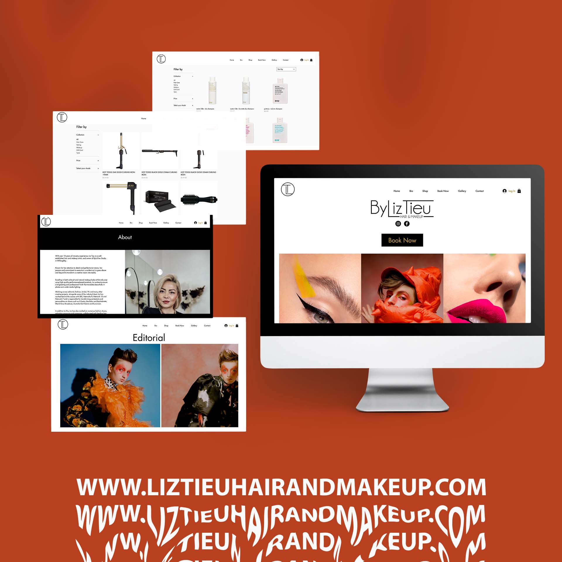
If you look at the website, we did for Liz Tieu, we wanted to show off her work as a service and inspiration source, as well as create a space to sell the products she uses. Now, her audience can have a greater and more valuable experience rather than just booking and leaving.
7- SEO & Essential Plugins
A website with excellent SEO takes advantage of the most current SEO practices. If a website doesn’t optimise for search, it means it’s losing traffic to the most popular websites.
Your website design should include features that will increase its performance and assist your SEO. If you want to improve your website’s search engine optimization, one of the best ways to begin is by ensuring that your site was built with SEO plugins. In addition, you can also improve your SEO by including more rich content, such as blogs with strong and specific keywords. This is something we took advantage of for Eurovision, because we could post SEO rich stories, blogs and entertainment based on the right keywords.
8- Email Marketing Integration
It is very important to integrate email marketing with your website! It gives you an opportunity to invite the audience back each time you announce something. In addition, it is probably one of the most personal ways that you can follow up with your entire audience on a one-on-one basis.
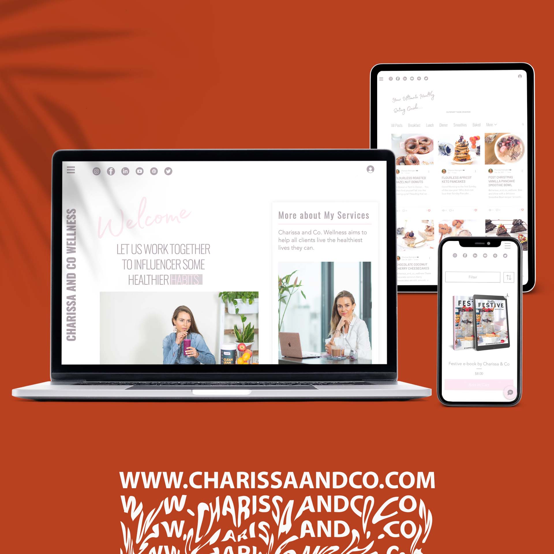
On the website, we developed for Charissa and Co. Wellness, we implemented this direct line of communication to share recipes, programs, lifestyle advice and promotional material that would lead the audience right back to her website long after they have left.
This was truly a great way to bring them back each time and build trust.
Overall, your website needs to reflect the value and have a purpose. With
547,200 new websites being launched every single day, you need to make sure that your website stands out and is well structured for both your success and your audience’s experience. Make that website work for you!
Stay in touch
Whether you’re an established company or a brand new start-up, We would be more than happy to help you a website that your company/brand deserves. Feel free to reach out to us at info@projectvstudios.com
